

Brand Refresh & Website Development
SLOW BURN THEATRE CO. – FT. LAUDERDALE, FLORIDA
NONPROFIT
Slow Burn Theatre Co. had the talent, the reputation, and the audience. What they needed was a brand and digital presence that finally matched the caliber of what was happening on their stage.
Services: Brand Personality · Visual Identity · Art Direction · Content Architecture · UI/UX Design · Website Development
Recognized with 2026 Gold ADDY Award for Integrated Brand Identity work
(AAF Suncoast Chapter)
The Challenge
For over 15 years, Slow Burn Theatre Co. has delivered Broadway-caliber productions to audiences across Broward County. The kind of work that stops you mid-sentence when you try to describe it.
The problem? Their brand wasn’t doing the same.
Despite a reputation built on excellence, many still mistook them for a community theater, or assumed they were associated with Broadway Across America and touring Broadway productions. Their website and visual identity had fallen behind the artistry happening on their stage. The disconnect created real challenges: unclear differentiation, an outdated perception of the organization, and a digital experience that didn’t fully support ticket sales, subscriptions, donations, or audience engagement.
Our challenge: Redefine how Slow Burn shows up in the world — visually, verbally, and digitally — and reestablish them as Broward County’s premier professional nonprofit theater.
The Approach
We didn’t start with a brief. We started with a question: What does it feel like to be part of Slow Burn Theatre Co.?
To answer it, we brought the Slow Burn board into a collaborative moodboard workshop, an interactive session designed to surface the emotional truth of the brand before anyone touched a color swatch or a typeface. What emerged was consistent: inspiration, storytelling, passion, craft, and a particular kind of wonder that only live theater creates.
Two distinct brand personalities emerged from the process: one rooted in passion and spectacle, the other in artistry and storytelling. Ultimately, we centered the identity around creativity, craftsmanship, and emotional connection — giving the organization a clearer and more differentiated presence moving forward.
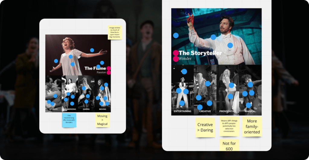
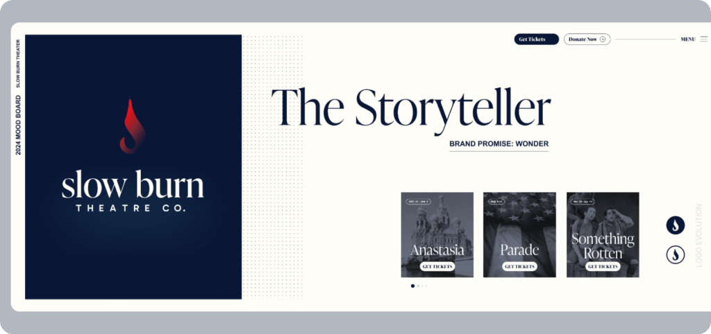
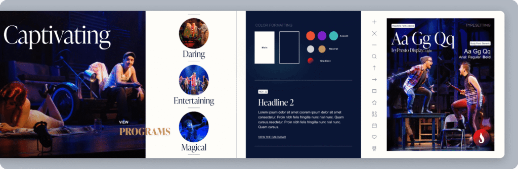
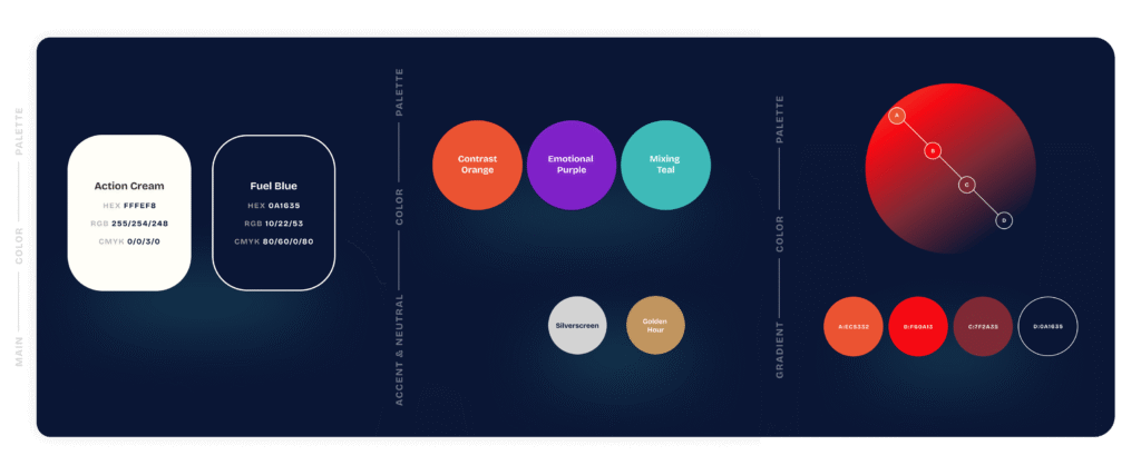
A collaborative mood board was used to define a clear visual system that informed key UX and design decisions, including color palette, typography, button treatments, and photography style.
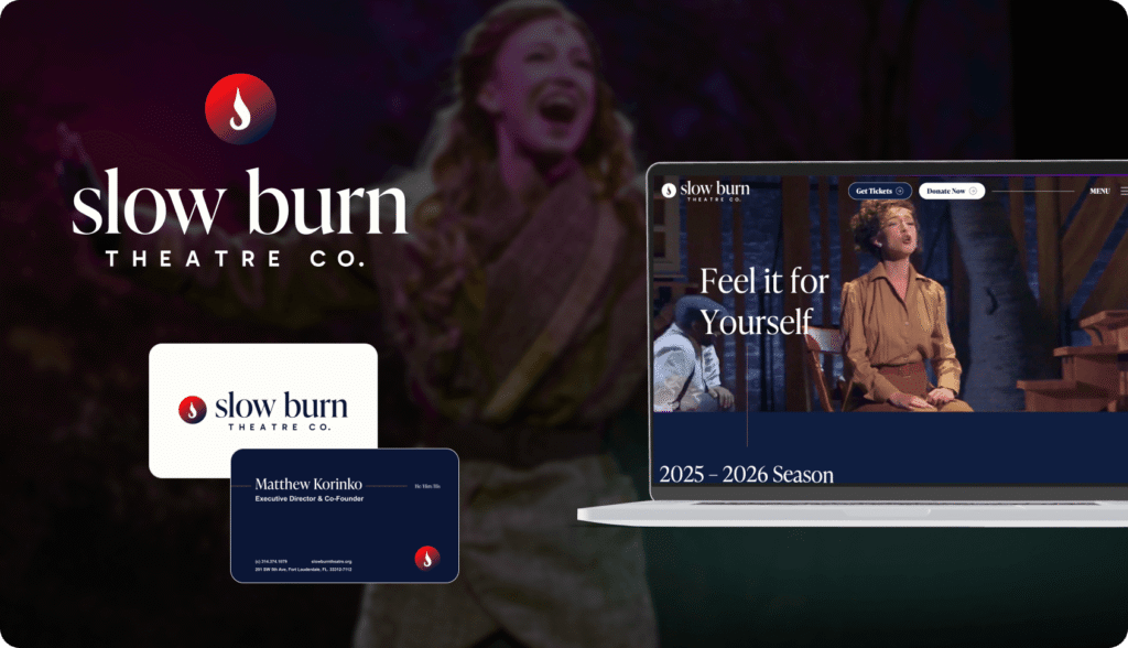
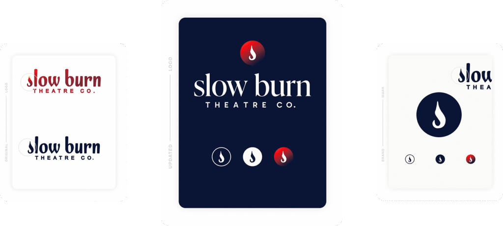
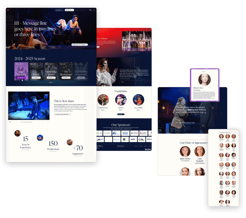
Visual Identity & Logo Refresh
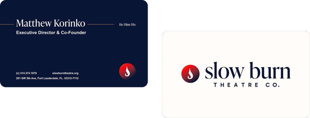
The iconic “S” flame was refined from the ground up — simplified, sharpened, and optimized for modern digital and print applications while preserving the equity audiences already recognized. A refined serif logotype replaced the old one, adding the sophistication and legibility the theater’s professional caliber deserved. The result is an identity that finally looks like the company it represents.
More importantly, it created consistency across every audience touchpoint, from posters and playbills to digital campaigns and ticketing experiences.
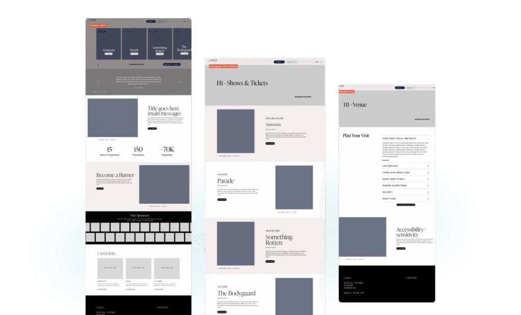
Website Design & Development
The new site was designed not just to look better, but to function as a more effective audience and revenue tool for the organization.
Built on WordPress Gutenberg Block Editor, the platform gives the Slow Burn team the flexibility to update content, launch new productions, manage season information, and support marketing efforts internally, without relying on ongoing developer support.
The design system flowed directly from the moodboard: color palette, typography, UI elements, photography treatment, and motion – all of it rooted in The Creator archetype. Cinematic in feel. Functional in practice.
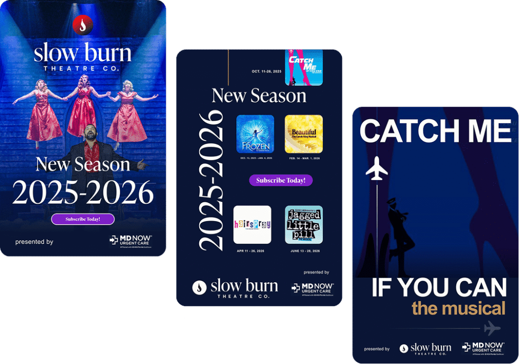
Every major user path was intentionally designed to support audience engagement and organizational goals, including:
- Dedicated show pages with cast bios, imagery, and production details
- Clear, well-placed calls-to-action for tickets, donations, and subscriptions
- Strategic urgency around show schedules and limited-run offerings
- A content architecture designed so that supporting, donating, or subscribing never feels like work
“HOME Agency truly got us. From day one, it felt like a creative collaboration—not just a project. The new brand and site feel bold, fresh, and uniquely us.”
— Julie Valent, Managing Director, Slow Burn Theatre Co.
Promotional sizzle reel.
The Results
Slow Burn Theatre Co. emerged with a clearer identity, a stronger digital presence, and a website designed to better support ticket sales, subscriptions, donations, and audience engagement.
The work earned multiple industry awards, but more importantly, it helped close the gap between the quality of the productions on stage and the way the organization showed up in the world.
HOME Agency continues to support Slow Burn as an ongoing creative partner across campaign development, collateral design, and email marketing.


